Magdesigns®
← All work

VIER · Enterprise SaaS (B2B)

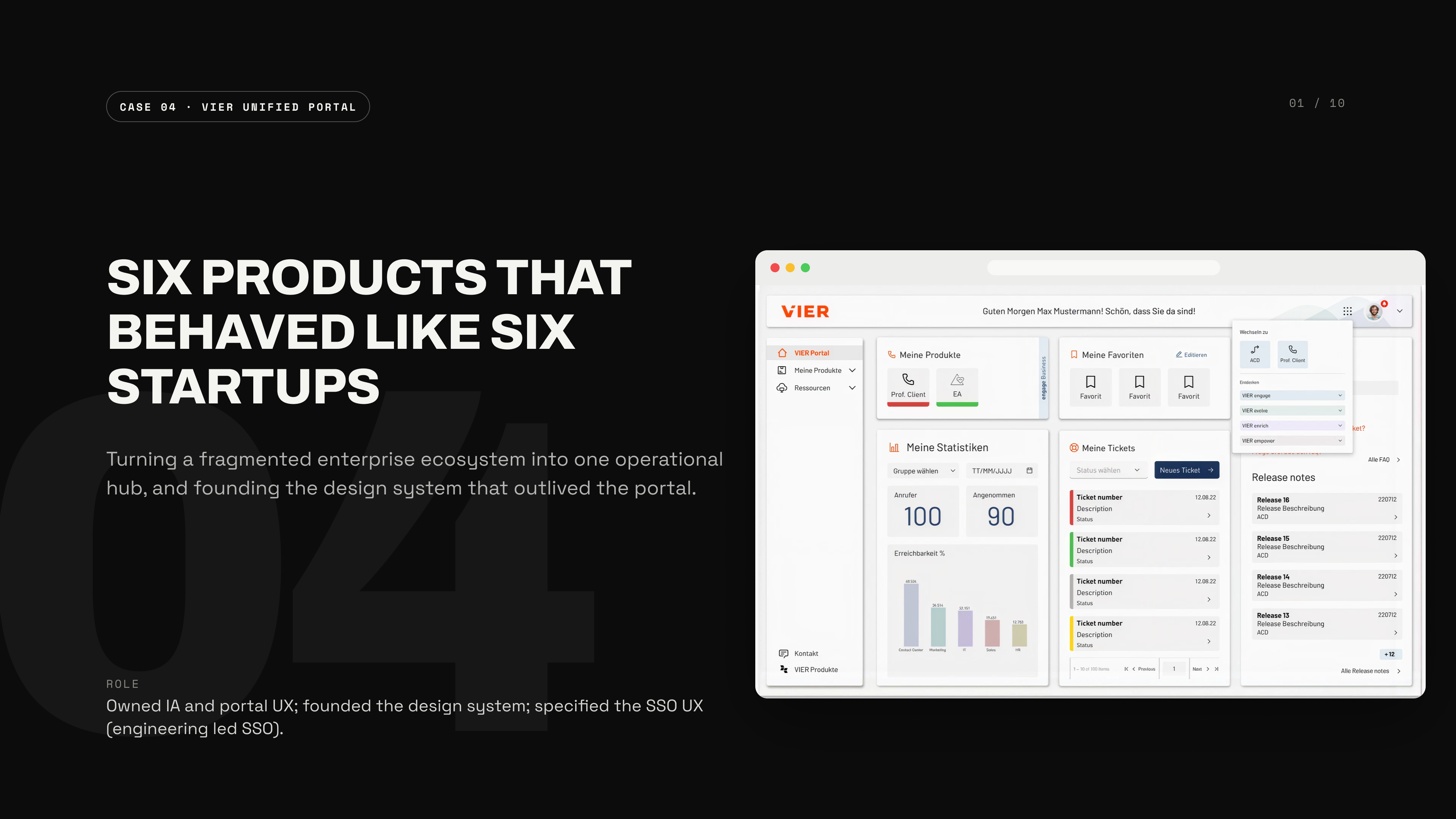
Six products that behaved like six startups

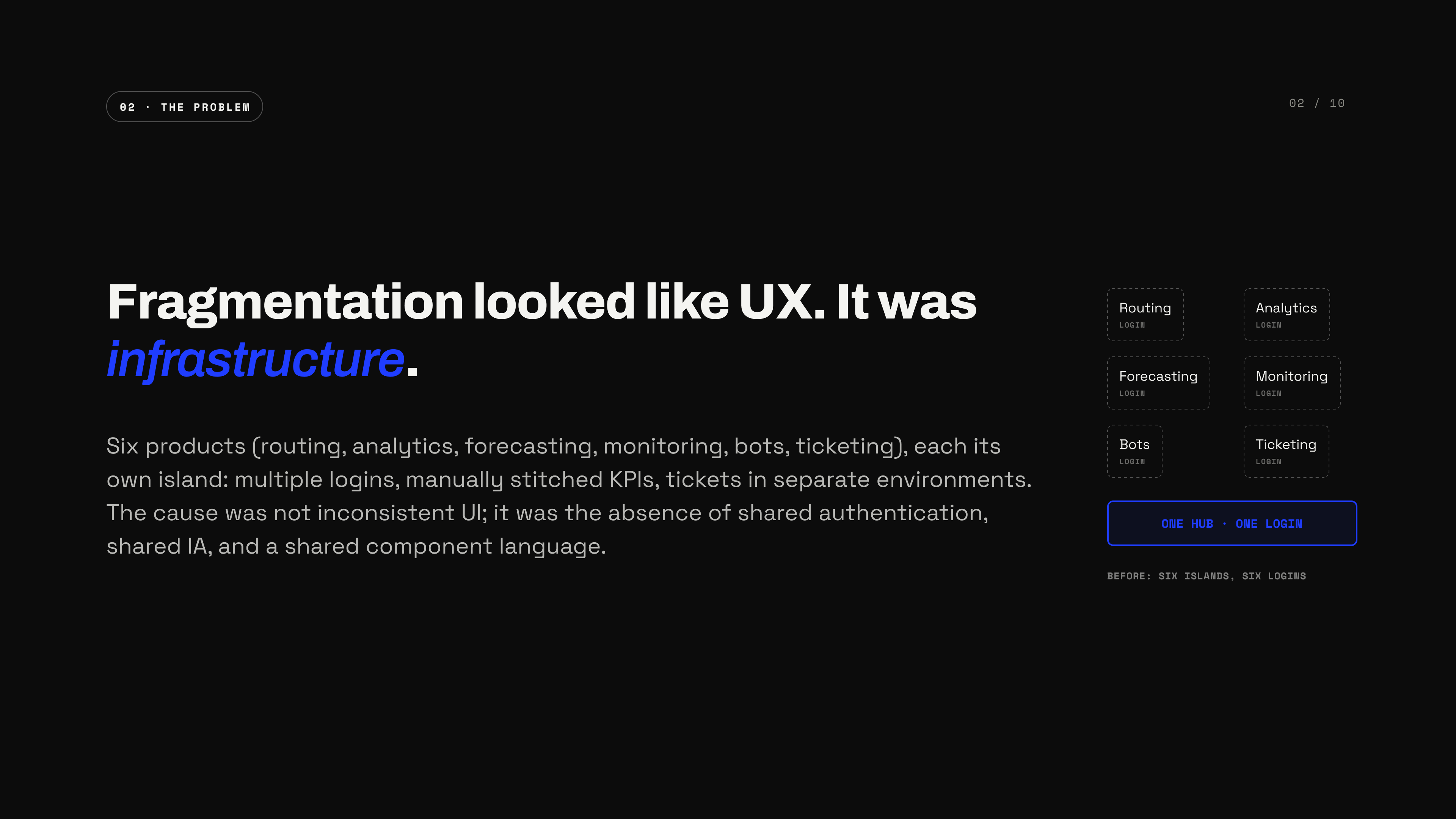
Six products — routing, analytics, forecasting, monitoring, bots, ticketing — each its own island: multiple logins, manually stitched KPIs, tickets in separate environments. The obvious read was "inconsistent UI." It was infrastructure.

ShippedOwned IA and portal UX; founded the design system; specified the SSO UX (engineering led SSO).
Role
Sr. Product Designer
Client
VIER
Domain
Enterprise SaaS
Type
Shipped
Six products that behaved like six startups — turning a fragmented enterprise ecosystem into one operational hub, and founding the design system that outlived the portal
01Cover
Fragmentation looked like UX, it was infrastructure — six products (routing, analytics, forecasting, monitoring, bots, ticketing), each its own island: multiple logins, manually stitched KPIs, tickets in separate environments; no shared authentication, IA, or component language
02The problem
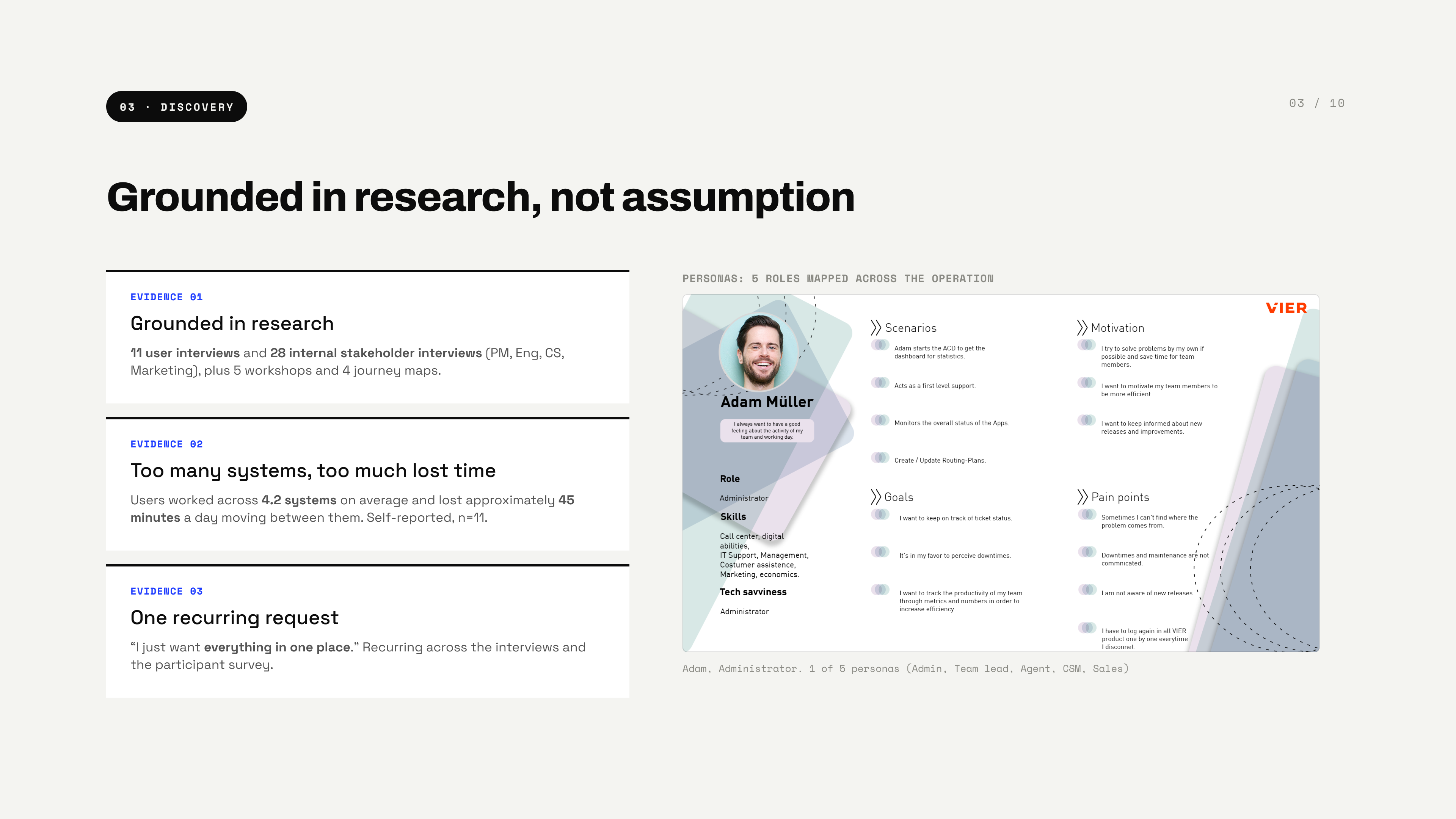
Grounded in research, not assumption — 11 user interviews and 28 internal stakeholder interviews plus 5 workshops and 4 journey maps; users worked across 4.2 systems on average and lost about 45 minutes a day; the recurring request:
03Discovery
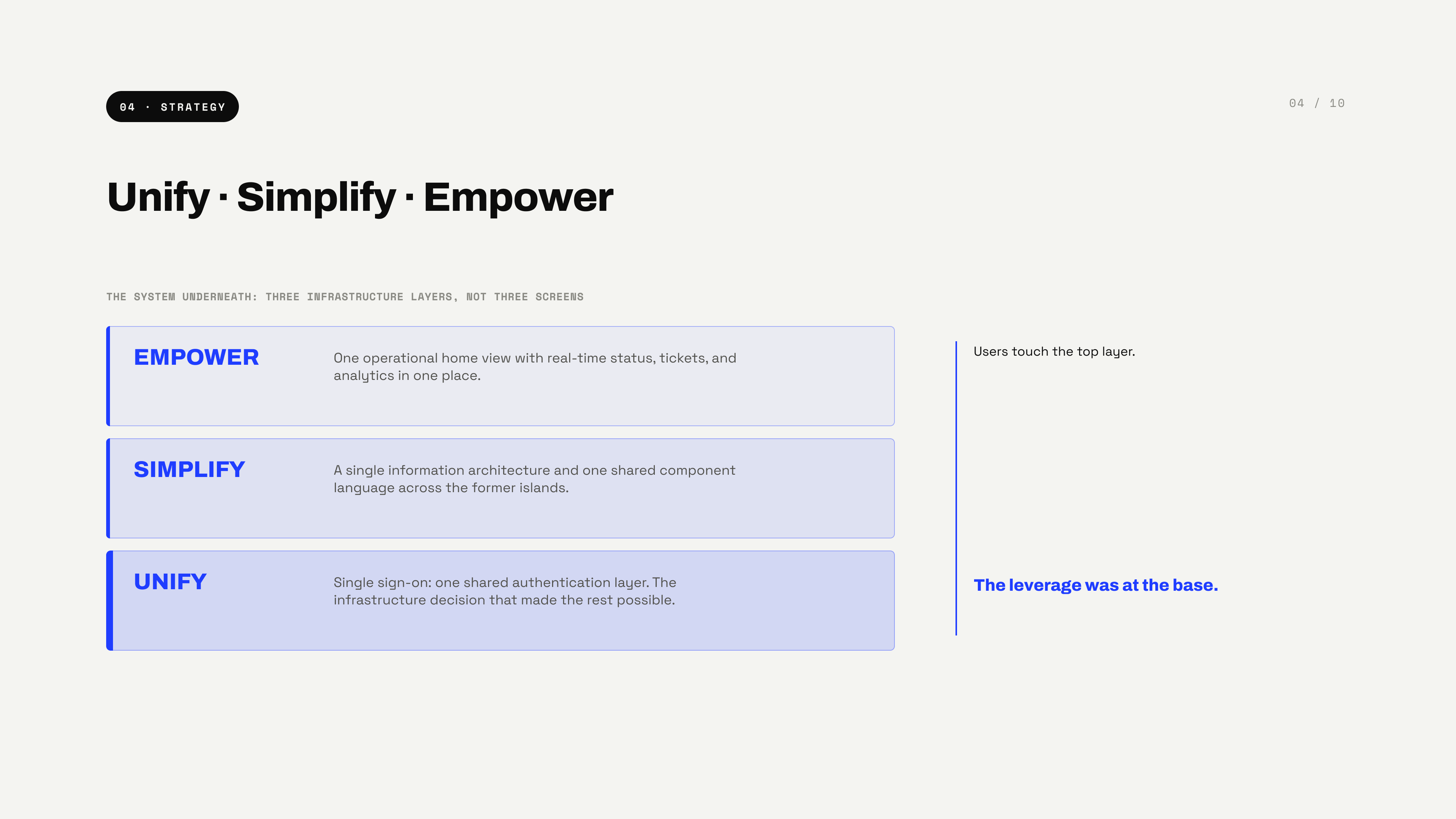
Unify, Simplify, Empower — three infrastructure layers, not three screens: single sign-on at the base, one IA and shared component language above it, one operational home view on top; users touch the top layer, the leverage was at the base
04Strategy
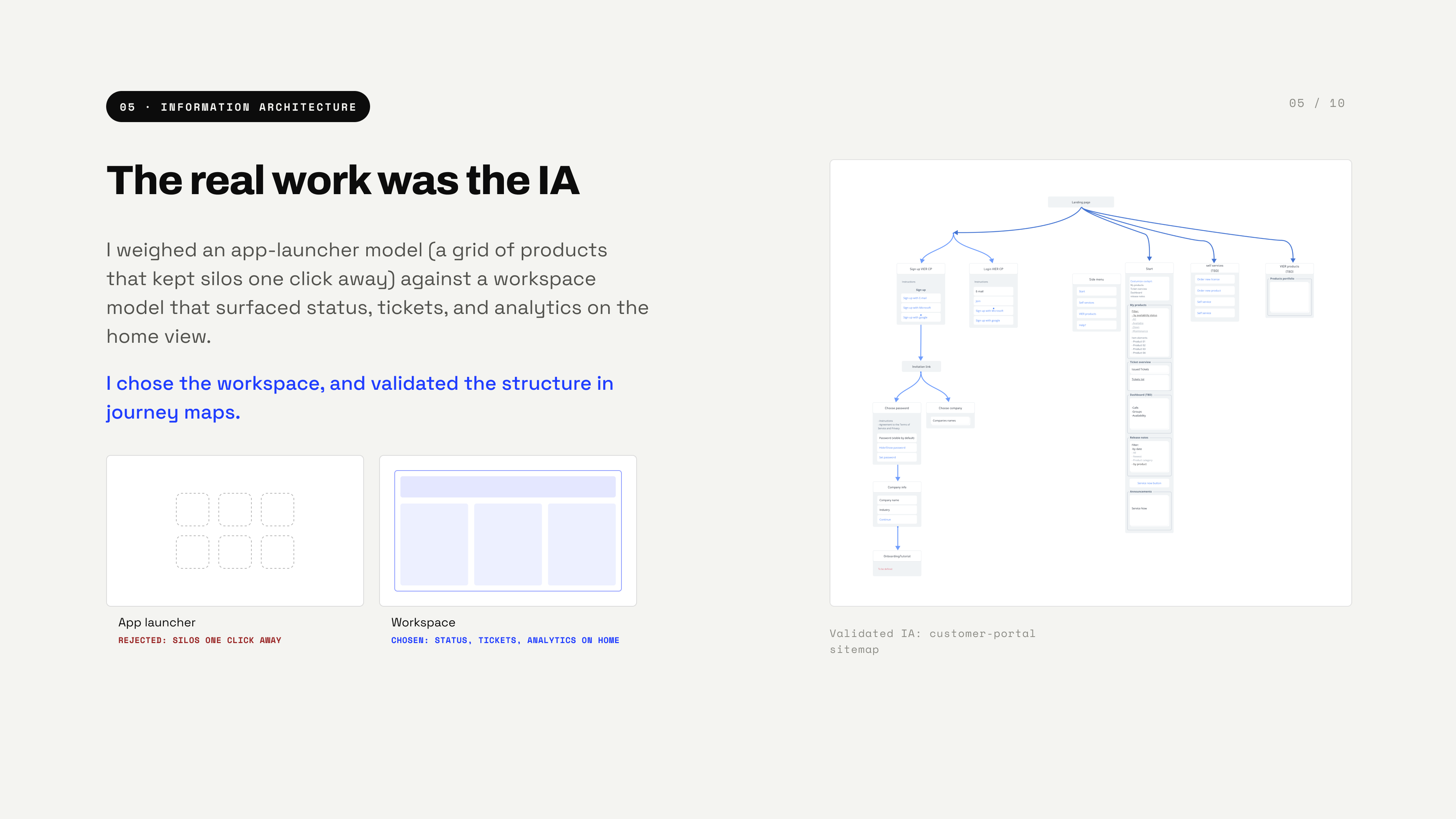
The real work was the IA — an app-launcher model (rejected: silos one click away) weighed against a workspace model (chosen: status, tickets, analytics on home), validated in journey maps; customer-portal sitemap as evidence
05Information architecture
A heavier home, chosen on purpose — the workspace model costs a denser home view, more to load on first paint, and more upfront IA work; accepted for what a launcher grid could never do: status, tickets, and analytics visible without a click
06The trade-off
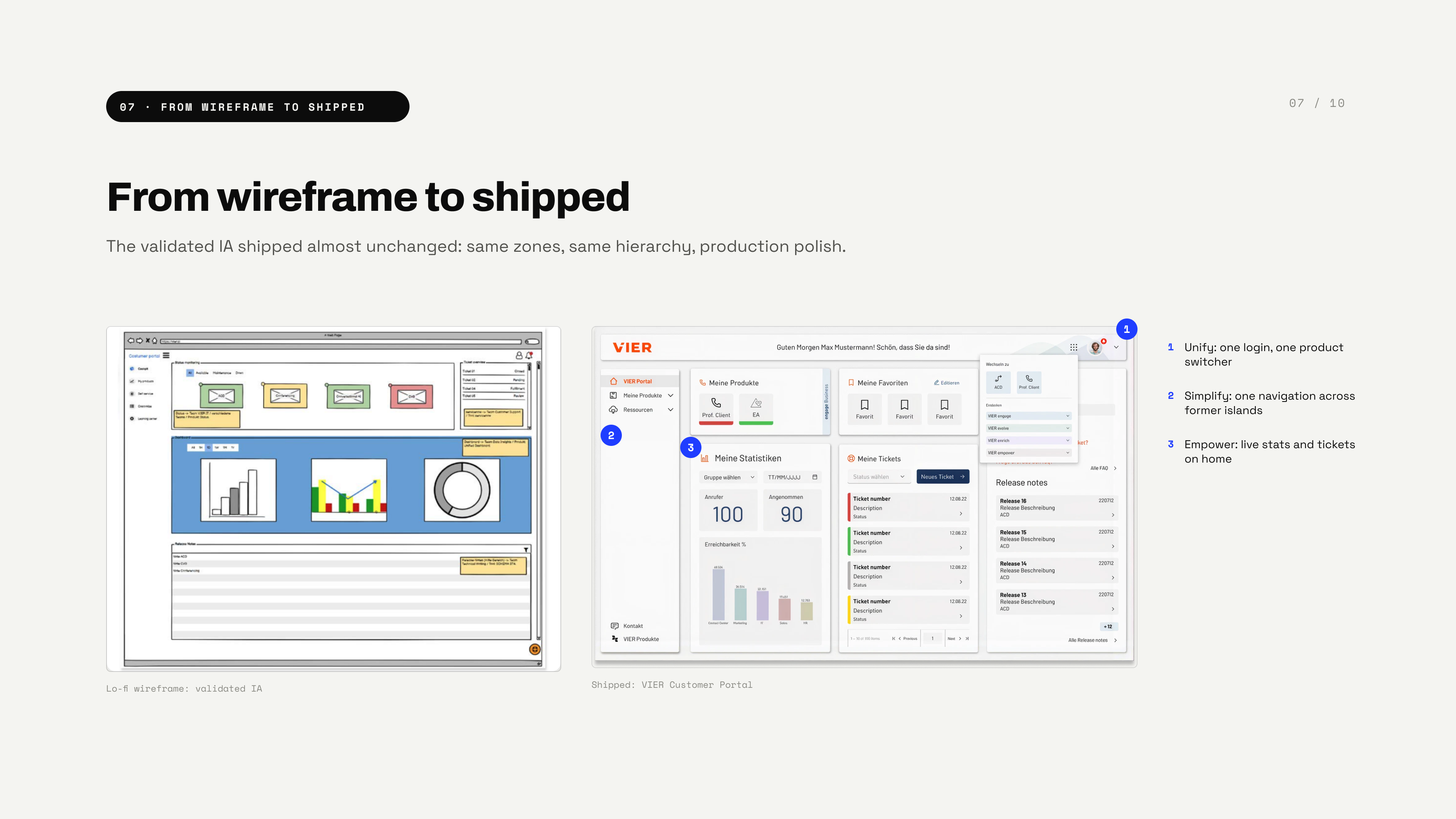
From wireframe to shipped — the validated IA shipped almost unchanged: same zones, same hierarchy, production polish; unify (one login, one product switcher), simplify (one navigation across former islands), empower (live stats and tickets on home)
07From wireframe to shipped
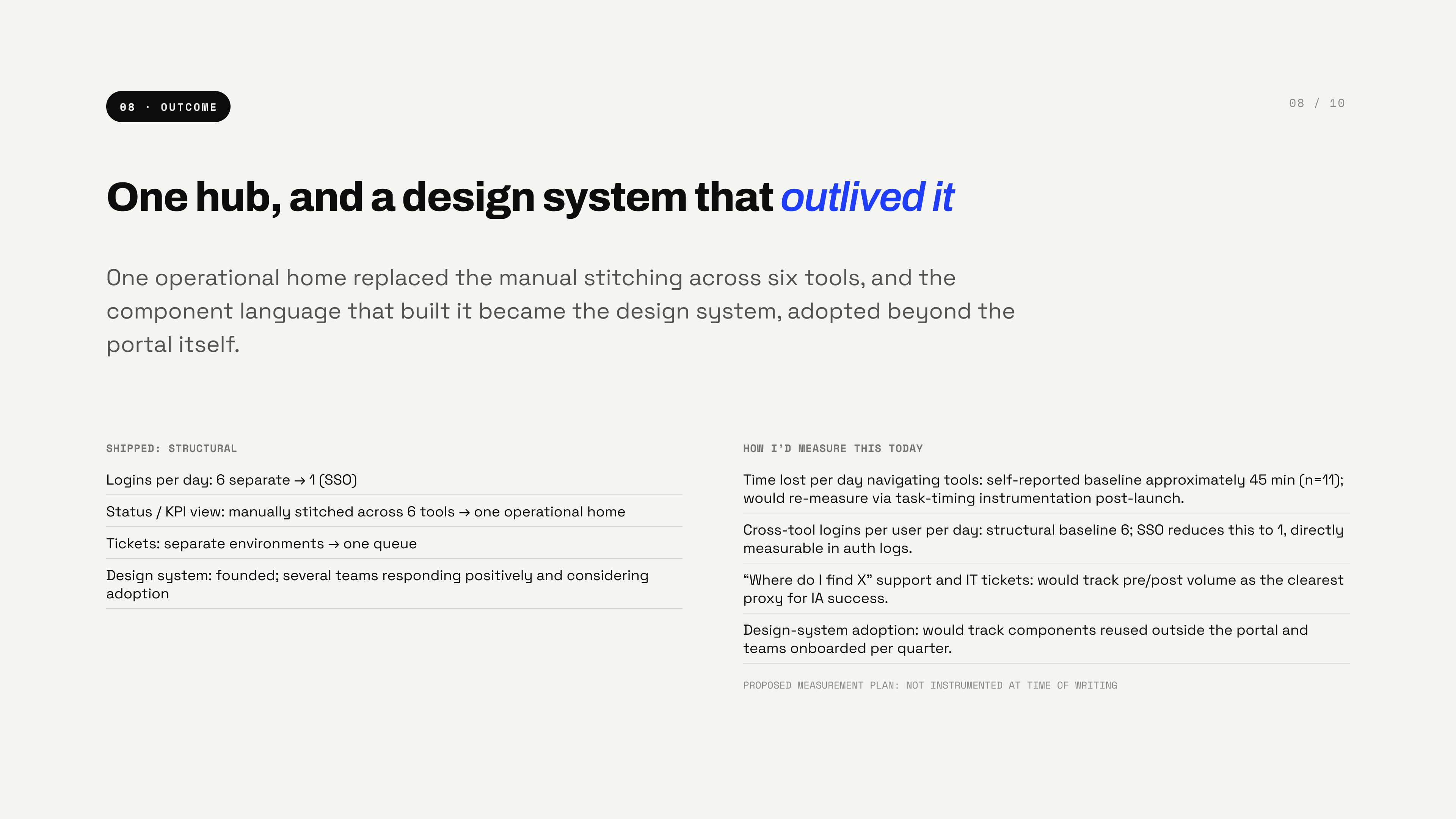
One hub, and a design system that outlived it — logins per day 6 to 1 via SSO, manually stitched KPIs to one operational home, tickets to one queue, design system founded; plus a proposed measurement plan, not instrumented at time of writing
08Outcome
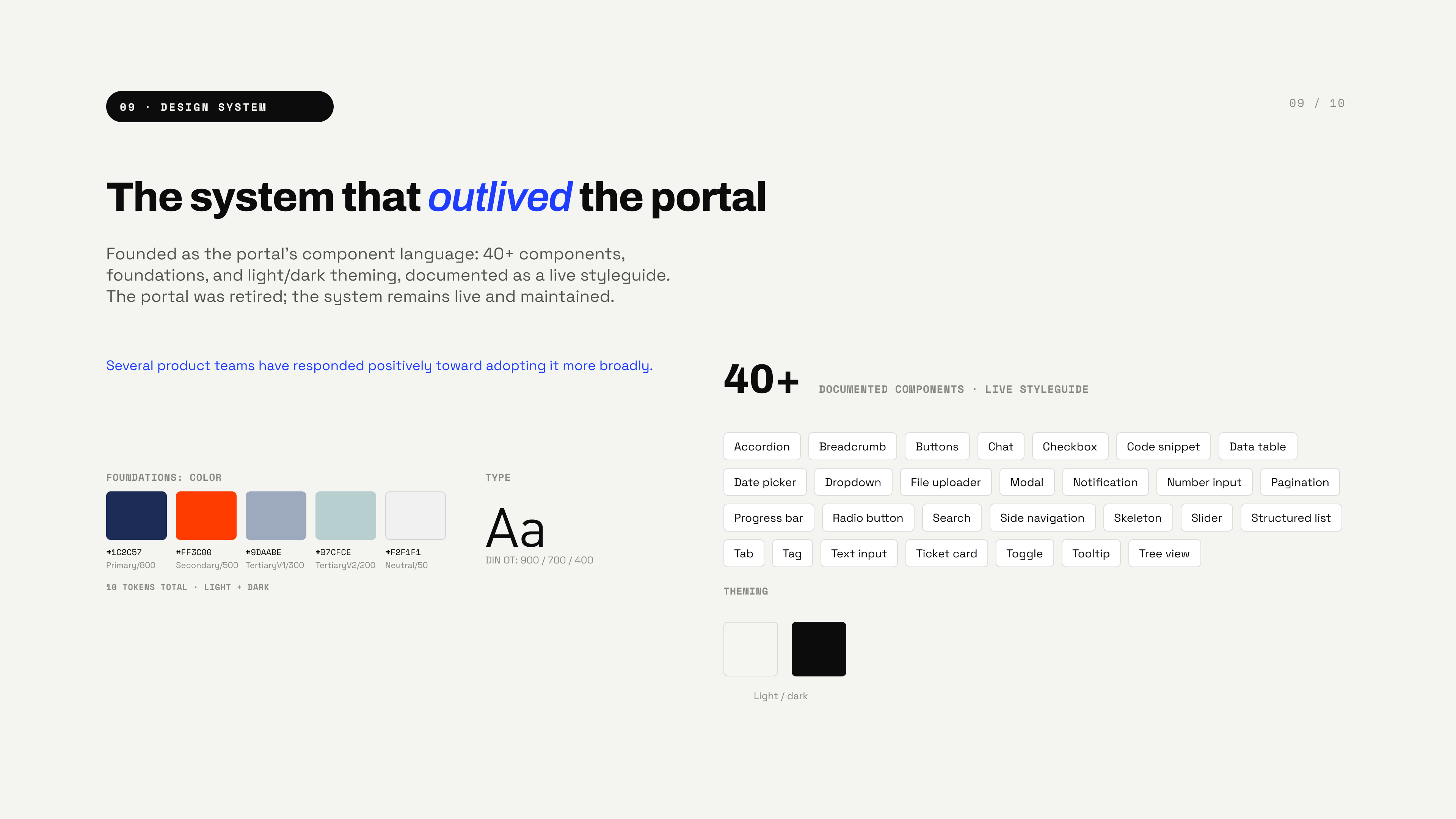
The system that outlived the portal — 40+ documented components, color and type foundations, light/dark theming, documented as a live styleguide; the portal was retired, the system remains live and maintained
09Design system
The highest-leverage decision was made above the screen — single sign-on became the most significant usability improvement because design sat in the architecture room, not because of visual design
10Reflection